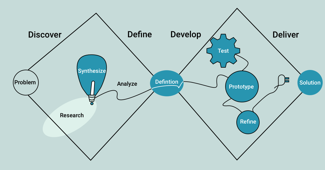
When it comes to (re)designing your website, UX isn’t a box to check off. It’s many layered and near living, part of both the infrastructure and the aesthetic design. The user experience design process can feel like a hedge maze—full of stops and starts, backtracking, and a few circles before you reach your destination. Good UX isn’t as daunting if you focus on it from the very beginning. While there are hundreds of ways to the center of the UX maze, we’ve found that these main focus points are particularly helpful.
1. UX Strategy: Roadmapping, Methodologies, and UX Research
Before you start sketching out ideas, you must have a strategy. User research to discover your audience, creating personas, and building a design roadmap are necessary steps for any UX team. Without fully understanding your audience, you can’t design an experience that successfully taps into positive emotional connections.
Copy matters too—unless you’re targeting people in your own field, you’ll want to cut any jargon and speak in your client’s language. Working under a certain methodology helps maintain the user perspective emphasis throughout the design process. Design Thinking, Human-Centered Design, User-Centered Design, The Double Diamond Model—these are some of the most well-known methodologies.

2. Understand User Habits
Thinking outside the box is usually great in creative settings. UX, however, isn’t the best environment for reinventing the wheel. Users have habits and expectations, intuition built up from decades of Internet browsing. User experience is rooted in empathy, in anticipating users’ needs because you understand them.
Don’t forget to take your own habits into account, too. UX research informs your web design decisions, but your intuition is just as useful. How do you swipe through mobile sites? Which parts of the screen are in easy reach of your thumb, and which require a second hand for balance? Where do your eyes automatically look for a menu? Visual beauty aside, which website experiences have elicited a negative visceral reaction?
Understanding user goals allows you to design for them. Understanding user habits allows you to design for them well.

3. Visual Hierarchy
People don’t read websites—they scan them. So how do you direct the eye to the most important areas of each page? Fortunately, it doesn’t take all that much to control user focus and attention. Visual contrast, strategic use of negative space, and overlapped elements that guide the eye through sections are all effective ways to create visual hierarchy. Emphasize the most important elements or ones you want seen first. For particularly maximalist or stimulating pages, use Gestalt principles to inform page layout.
“The Gestalt Principles are a set of laws arising from 1920s’ psychology, describing how humans typically see objects by grouping similar elements, recognizing patterns and simplifying complex images. Designers use these to engage users via powerful—yet natural—“tricks” of perspective and best practice design standards.”
Seeing a business’s website for the first time can be intense. There’s so much to look at even without active elements like autoplay videos, animations, or carousel images. Gestalt psychology holds that the mind handles the chaos by looking for patterns and categories. Your users want to sort the elements on your page into groups. Use constraints, colors, and proximity to facilitate this.
4. Design Website UX for all Devices
Your carefully crafted desktop website will not look good on mobile. Period. Don’t wait until you’re deep in the design work to shift your attention to mobile platforms.
Mobile usability is of the utmost importance. Users will sooner leave your site than spend their time pinching and zooming all over the place. Design the mobile and desktop versions in tandem to ensure seamless transitions from one platform to the other. Remember that section on user habits above? Mobile usability is all about user habits. We don’t surf the web on phones or tablets like we do on computers. Our mannerisms, muscle memory, and expectations are entirely different, and your mobile design should reflect that. The design structure may be different, but shared elements and branding help create a smooth shift from one device to another.

5. UI UX Design: Less Is More
For UI/UX design, usability ranks above creativity. Don’t overthink things trying to add every bell and whistle you just saw on Behance. Nor should you try to reinvent the wheel—people recognize typical website UI elements and will be frustrated if they have to search around for them. The backbone of good UX design is its ability to disappear into the woodwork. We tend to notice things that bother us more consciously than things that are comfortable or enjoyable. Follow your roadmap and use design elements as bumpers that keep the user on the right path. Calls to action should motivate, and animations are a solid standby for positive user feedback. An animated CTA, though, will likely distract the user.
Of course, “Less Is More” doesn’t mean lock yourself into a minimalist design. Rather, it’s more about taking your ego out of the equation. Which leads us to our final point.
6. Audit. Revise. Repeat.
Beautiful design is pointless without user validation. You can’t know what a user needs all by yourself, and no user will ever be as familiar with your website as you are. It’s easy to fall into the assumption trap where you know what is or should be coming next. This is where those small bridge steps, critical to guiding the user, are often lost. To the user, this creates frustrating gaps in the roadmap. Unfortunately, this likely means they’ll leave your site for another business. This is why starting with design thinking is so helpful. The pre-design research stage provides the data you need to inform your work. Then once you start, constant self-audits and validation along the way ensure any errors or design snags don’t get buried along the way.

