User Experience is one of those intentionally vague terms. You’re not quite sure what it means at any given moment because its definition is as subjective as the experience it describes. Sure, you have a general idea of the concept, but the exact meaning involves so many factors that you can’t quite nail it down. It could mean the overarching feeling you get from using a product, or it could mean the design process from ideation to customer satisfaction, or it could relate to User Interface (UI) design. All of these are right; the definition just depends on the context. In the end, user experiences comes down to the feeling a product evokes. How did you feel using this product? Was it intuitive and straightforward, or did it cause frustration?
Where Did UX Come From?
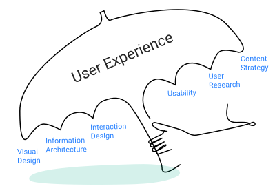
The term “UX” came about in the 90s, from Don Norman. Norman started as an engineer before shifting to psychology and cognitive science. Sometime later, he realized how impactful his latter field was upon the former. Designers and engineers may build beautiful, innovative creations, but if they’re difficult to navigate, then people won’t use them. Norman coined “User Experience” as an umbrella phrase to describe someone’s experience with a system—not just the interface and function but the feeling that you get from all the pieces of the puzzle put together.
“I invented the term because I thought human interface and usability were too narrow. I wanted to cover all aspects of the person’s experience with the system including industrial design, graphics, the interface, the physical interaction, and the manual.”
—Don Norman
Norman doesn’t just address shiny new technologies that need manuals. He emphasizes the importance of everyday items that so often trip us up. How many times have you struggled to figure out an unfamiliar shower or walked into a glass door? Even actions as simple as pulling up the window blinds have been known to stump otherwise intelligent humans here or there.

These are the simple, daily items that shouldn’t cause us trouble. If they had excellent user experience design, you might not notice them at all. Instead, it’s the lousy design that jumps out at us.
The Elements of User Experience
UX is a broad umbrella that encompasses the entire life cycle of a product—one that doesn’t end with a sale but continues through the product’s entire lifetime with the consumer. It’s the human element, the emotional and psychological impact something has on us. Brands promise more than just products. If they didn’t, Apple’s advertising would be very different. Take a look at this Christmas 2018 ad from Apple: Is it selling a product or a feeling?
User experience is a profoundly complex field. After all, it deals with human behavior, one of the most complicated subjects there is. While UX is an excellent general term for the subjective emotional response to products, it breaks down into many moving parts. The design process is iterative and demands communication and a deep understanding of the end users’ requirements and abilities. When you factor in the usual work environment constraints—budget, timeline, etc.—those involved with UX have their work cut out for them.

In a nutshell, the elements of user experience include:
Visual Design
The visual elements, from typography to colors to hierarchy. These should be strategized from both UI and graphic design points of view.
Information Architecture
Just as architects map out a building’s framework, information architects do the same for software. Information architecture is the base structure behind an app or website’s interface that is carefully mapped and designed.
Interaction Design
All UX elements are woven together, but interaction design forms a particularly tight trio with visual design and information architecture. Together, they compose the foundation for a quality user interface. Interaction design specifically handles identifying the user’s ideal path and how to guide him through it.
Usability
Is your app easy to use? Can you navigate the website with ease? Usability can exist outside of good UX but not vice versa. Do the product features make sense, or do you need to consult the manual every few minutes? Usability steps back from the nitty gritty details of visual design and architecture to make sure that anyone can access and navigate the product, regardless of context and ability.
User Research
Before building a product, you need to know for whom you’re designing it. If you don’t put the research in, you may end up with a beautiful product that nobody wants because it doesn’t fulfill any needs. User research provides the necessary information for success once you go to market, and it informs any tweaks or pivots afterwards.
Content Strategy
You need content, but which type of content? Think of content strategy like curating a museum. There’s plenty of copy you could throw out there, but publishing content willy-nilly is detrimental to the overall vision and experience of the product. Content strategists decide what goes out when, how, and most importantly, why.
When UX Fails
A product may work precisely as its engineers intended, but if at the end of the day you’re not thrilled with it, then the UX has failed. Maybe it was tricky to understand, had too many components, or just left a bad taste in your mouth.
“That’s the point: even experts make errors. So we must design our machines on the assumption that people will make errors."
—Don Norman, The Design of Everyday Things
As Norman realized, engineers built machines based on logical design rather than in tune with human behavior. A design may be perfect in theory, on paper, or even in testing, but we all know that the best laid plans often go awry.
Think of the last time you had trouble using a product. It was working perfectly fine, but maybe the buttons weren’t labeled, and with one wrong push, it stopped working. If there aren’t any clear signals why this happened, how do you know you pushed the wrong button? According to the machine, it’s doing what it’s programmed to do when given a specific command. To you, it just seems broken. A product that went through a well-thought-out UX cycle should highlight the error in a way that the human user recognizes and understands the issue and knows how to move forward.
This is where human-centered design (HCD) comes into play.
Human-Centered Design
HCD is a design approach that puts the human before the design. By working with human needs, capabilities, and behavior in mind, designers can work to meet those demands rather than creating products out of sync with natural intuition.
By working through the typical HCD cycle of researching, prototyping, testing, and refining, designers make sure that each iteration of a product is the right balance of technology and psychology. Without UX research, designers can’t empathize with users’ needs. Once they understand their users’ parameters, they can make a prototype to test. Designers then refine the product based on test results and then start the cycle again, farther along than they were before.
UX versus UI
User Interface (UI) is part of the greater user experience whole. You cannot have one without the other. But where is the line between them? The UI is what you interact with. UI designers come up with the graphic elements you see on your screen, like the size and color of buttons. They decide the flow of an app or the physical appearance of a product. UX is the overall emotional response the end user gets from interacting with that interface and the product as a whole.
"UX is focused on the user's journey to solve a problem; UI is focused on how a product's surfaces look and function." —Ken Norton
Essentially, UI is tangible, while UX is abstract and subjective. You can’t point at a feature and decide whether it’s good or bad UX, but you can pinpoint areas of the user interface.
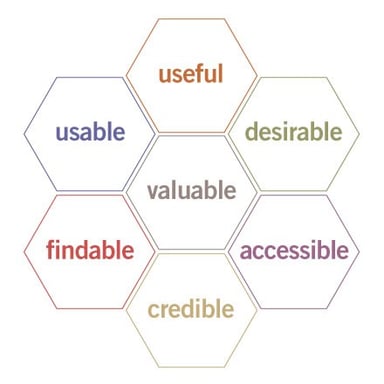
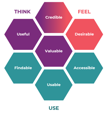
For example, take the UX honeycomb, introduced by Peter Morville in 2004. It’s a visual representation of the cardinal user experience facets. Ideally, a product delivers value to its user. That is accomplished best by taking the aspects on the outer ring into account.


This image is incredibly well known in the UX world, yet the graphics don’t quite show the connection between each piece of the honeycomb or how one should approach them. So UX consultant Katarina Karagianni redesigned the graphics to be more overt—she tweaked that part of the UI. With her version on the right, you can see how the aspects link up with the various ways in which users interact with products and how they relate to each other. The small visual changes make it much easier to understand at first glance.
Both honeycombs have the same information, but which one would you prefer to use?
Why Does Good UX Design Matter?
You may have a fantastic product that’s poised to disrupt the industry, but if you can’t nail down excellent user experience, your vision is likely to fail. Whether you’re a startup or established corporation, competition is everywhere, and everyone's jostling for space and attention. Brand loyalty is vital in this day and age, and well-designed UX is a crucial differentiator in maintaining your edge. When people have good experiences with a brand and its products, they continue to support that brand. If they have bad experiences, they’ll likely air them on Yelp and then never return.
Think of IKEA. We all go there for our furniture, but does the thought of building it fill you with dread? How many jokes are out there about mysterious extra pieces or a brand-new table falling apart even though you followed the instructions exactly?

Or take streaming services, for example. You likely have a favorite, not just because of the content available but because of the interface. Maybe you’re used to Netflix, and Hulu feels confusing. Or you like the old HBO GO, and the redesign threw you off. Paying attention to UX means you care about the human element—what people want and can handle—rather than what you might prefer to do on your own.
A great example of UX evolving over time is how we connect with businesses. First, you would make a phone call. Then technological innovation led to chatbots and now live chat. All of these methods have their trade-offs but clearly represent a shift toward greater user-friendliness. Chatbots took away the need to navigate menus or wait on hold. Live chat continues the instant response time but returns the human element in place of easily confused bots.
Taking it one step further, today we have phone-style live chat that eliminates the time spent typing out questions, as well as the potential misinterpretation on the other end. OnSIP sayso does just this. Our voice chat solution lets you have an actual conversation with real humans right through the browser, rather than typing into the abyss or going ballistic over unhelpful AI. We built sayso because we felt there was room for a better user experience in the business communications market.
You can easily find the sayso button on a website, but it’s not a constantly expanding—and annoying—pop-up in your face. It’s simple—just click! It’s accessible, thanks to both video and voice options, as well as text translation. It’s credible because we built it from scratch, just like our hosted PBX system. And for those of us who would rather never see a chatbot again, it’s certainly desirable.
In the end, “good user experience” is always subjective and will never exist as a one-size-fits-all scenario. The best we can do is make sure we’re putting effort into every aspect of the UX design process and creating for the way people are, not how we think they ought to behave.

