Every once in a while, I come across an innovation that makes a task in my life much easier. It's that feeling of clarity when the clouds open, sunlight shines down, and I wonder how I ever got along in life without it. Some examples: Google Maps/Docs/Mail, keyless pushbutton car ignition, Shazam, PetFoodDirect.com, SeamlessWeb, HopStop.com, Kindle Mobile App, Alarm (any, on mobile phones), and now Mockingbird.
What is Mockingbird?

Mockingbird is a web-based tool to make and share wireframes. For those of you not in the website development world, wireframes are visual representations of proposed design elements for a website interface. You can think of them like a blue print of a website - outlining elements such as header, footer, navigation, image placement, text placement, etc. for your website. Wireframes are produced before website design begins because they guide the designer in creating what the team has decided upon.
How I Came to Mockingbird
As a person in marketing, I often plan new pages for our website. For example, in the last year, we redesigned our homepage and features pages. We have created a few landing pages for different promotions and efforts. Usually, this involves a lot of description to the designer. I found myself writing long descriptions of what is desired on the page, as well as fumbling around with Photoshop and Powerpoint to illustrate.
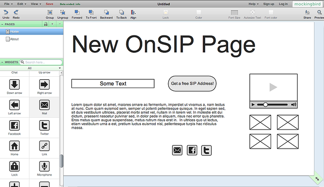
Though I knew there were a slew of downloadable software packages for wireframing, I avoided them. I avoided them because choosing one required researching and comparing software, distributing the software to coworkers, and learning it, myself. But, as I was elbows deep in new webpage ideas one day, I decided it's time I get an efficient wireframing tool. And then, the light bulb: Most of our office tools are Software as a Service (SaaS), like our hosted phone service. Perhaps I could find a web-based software? So, after a little sifting around, I stumbled upon Mockingbird. The “Try it Now” for Safari, Chrome, and Firefox button was so enticing; I clicked, and, to my surprise, the full application launched on the spot. Check out the screen shots and description below.
Mockingbird Review
Features
On the left side of the screen, you’ll find a bunch of website elements – From links, to text boxes, to maps, to share buttons, to lines, to images, and more. You can drag and drop the elements to the right window pane, the page you’re working on. You can modify each element (e.g. link and text, size). And, at the top of the screen, you can change the font size and color.

On the top left pane, you can create new pages, copy your current page (helpful if you’re creating many similar pages), and delete pages. Above that, you can save your project. (File > Save As), and you can export to a PNG or PDF image file (File > Export). Another helpful feature is that you can instantly share what you’re working on with a link. To do so, you can click on the Share button on the top right and copy the link to send to a friend or coworker.
These features are the basics you’ll need for creating a wireframe. In fact, I would have to say it’s the perfect amount of functionality for our purposes. If it provided further options to, say, change the font, I could get bogged down in the appearance and forget this is a wireframing program - not a design program. The only feature I would suggest is the ability to collaborate on the same project at the same time with your coworkers. My coworker, Leo, and I tend to share an account and pass the wireframe back and forth before it’s done. It would be great if we could just draw at the same time.
Cost
Now that Mockingbird has moved beyond Beta, they are beginning a pricing structure. In my humble opinion, I think it’s very reasonable for a small business.
The team plan allows for 10 active projects a month and unlimited archived projects at $20/month. This is good for our team because we likely won’t need more than 10 working wireframe projects at a time. Once we finish wireframing, we’ll export to a PDF, send to our designers, and archive the project. Happy wireframing!